

A Guide to Figures
Figures are a tricky part of any research paper. When done right, a graph or chart can condense a lot of information into a small amount of space and help readers better understand your work. When done poorly, though, figures can lead to confusion and end up hurting your paper. So how can you make a figure that will get the job done?
What Is a Figure?
In general terms, a figure is just any sort of visual aid. It can be a pie chart, an illustration, or a map. In this article, we're going to be focusing on figures that are representations of data, specifically line and bar graphs, scatter plots, and pie charts. These type of figures are essential to science writing and allow writers to present complex data in a way that's easy for readers to understand.
If you need help understanding why figures are important, think about a website or textbook that you recently read. Maybe the website had a particularly striking photograph or the textbook had a well-done diagram that explained a complex concept; whatever was on the page, chances are you remember the graphics better than you remember the text. Images are powerful, and most people gravitate toward them. If you include good figures in your work, you can take advantage of this fact to capture the reader's attention and communicate your ideas in a way that's memorable.
Types of Figures
We're going to talk about four different types of figures here: line graphs, scatter plots, bar graphs, and pie charts are the main types of figures used in scientific writing. With these four graphics you can cover a range of different types of data, and each is well-suited to a particular type of information. In the sections below, we'll look at each one individually and discuss what makes them successful as well as when each one should be used.
Line Graph and Scatter Plots
Line graphs and scatter plots are used to show the relationship between continuous variables, which are variables that can potentially fall anywhere within a range of values (we'll get to discontinuous variables later on). If I take someone's temperature or measure rainfall, those are continuous variables because the values I measure will fall somewhere on a continuous scale (e.g., a person's temperature is likely to be somewhere between 95 and 104 degrees F, depending on how healthy they are).
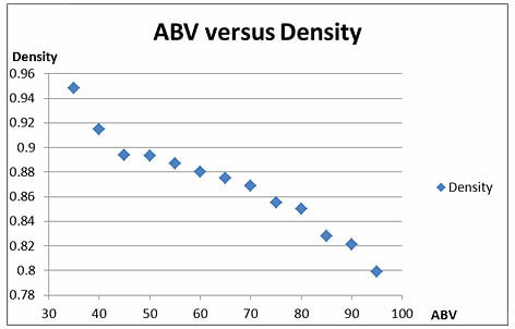
In these types of graphs, variables are assigned to one of two axes. The independent variable, which is the variable the researcher is manipulating, goes on the x-axis, which is horizontal; the dependent variable, whose response to the independent variable is being measured, goes on the y-axis, which is vertical. When data points are plotted as individual points, it's called a scatter gram or scatter plot. In the example below, a series of mixtures were made that had a range of percent alcohol, measured as alcohol by volume (ABV), and the corresponding density of the mixture is on the y-axis:
Figure 1.
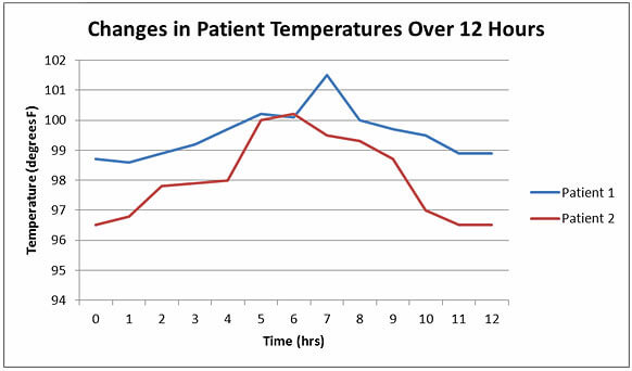
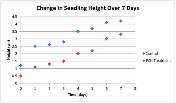
When the individual data points are joined together, you have what's known as a line graph. In the example below, the temperature of two patients (the dependent variable) is taken every hour over the course of a twelve-hour period (time, which is the independent variable):
Figure 2.
Scatter plot or line graph?
The same set of data can be shown in either a scatter plot or a line graph, and which you choose will depend on what you're trying to illustrate with your graph. Scatter plots are best used when you want to show an overall trend, for example that the data is sloping down or upwards. When a regression line is added, scatter plots can show the mathematical relationship between two variables. For example, the scatter plot above illustrated the general downward trend of the data, indicating that density decreases when ABV increases.
Line graphs, on the other hand, are best used when you want to point out differences between pairs of points. In the sample line graph above, there's no general trend in the data. Instead, what we want the reader to see is how the measured temperature changed from hour to hour. Notice that by including more than one line we're also able to show not only the changes in individual patients, but also how several patients compare.
Parts of a graph
There are a number of elements that line graphs and scatter plots need to have in order to be considered complete:
- A title: Graphs should have a title so that readers know what they're looking at.
- Axes: Most graphs will have an x- and a y-axis, although more complicated graphs can include a z-axis (for three dimensional graphs), or have more than one x- or y-axis (to include different data sets on the same graph).
- Labels: Each axis should be labeled with the name and unit of the variable.
- Scales: Include scales on both axis so that readers can easily and accurately read each data point.
- An origin: The x- and y-axis should intersect at the origin.
- Symbols/lines: The data should be clearly marked either by symbols or a line.
- A legend: Include descriptions of the symbols in the legend.
Scale
Scale - the numbers on the x- and y-axis-is one of the most important aspects of a good graph. Many students make the mistake of either just accepting computer program recommendations for scale or just always starting their scale at zero, which can lead to misleading or hard-to-read graphs. For example, in our line graph example above, if we set start the scale for each axis at zero, we get a very different looking graph:
Figure 3.
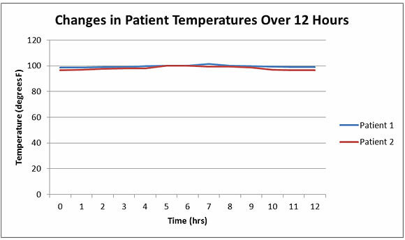
As you can see, now our lines have been compressed, and it's impossible to see the changes from hour to hour. If we want the reader to be able to see the shifts in the data, we need to change the y-axis scale, as shown in Fig. 2.
While it's important to adjust scale so that data can be seen clearly, it's also important not to use scale to distort the importance of your data. By narrowing the scale, it's possible to exaggerate what are in fact small or statistically insignificant differences-the movement of the line might look huge on the graph, but in reality it only represents a small change. Using this technique, called supressing the zero, in academic writing will discredit your work and will likely cause you a lot of trouble.
Making graphs easy to read
The whole point of using line graphs and scatter plots is to take a complicated set of data and make it easy for the reader to understand, which means keeping your figures clear and simple is an absolute must. Stay away from flashy visuals that distract from the data, and avoid piling extras onto the graph that will distract from what's important (e.g., don't use 3-D symbols or lots of colors).
You also want to make sure that everything on your graph is easy to read. Use a simple, sans-serif font, and make the text big enough. You also need to make the most out of the small amount of text you can squeeze into the axis titles and legends-there should be enough information on the graph for the reader to interpret it without having to look back at the main text (if necessary, you can include other explanatory information in a caption). Let's look at a graph that does a poor job of being readable:
Figure 4.
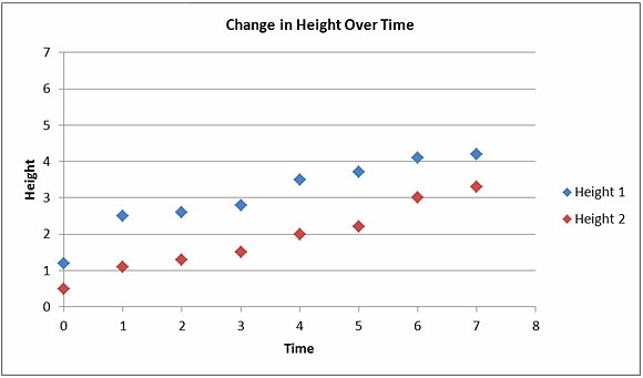
There are a number of things we could do to improve this graph:
- The title of each axis should include units so the reader knows what these numbers mean.
- There is lots of extra, wasted space at the top of the graph that has no data points, so the scale of the y-axis needs to be changed.
- The title is both too small and doesn't give enough information. Remember, the reader should be able to tell what's going on in a figure without looking back at the main text.
- The legends also do not give the reader enough information. What do the numbers 1 and 2 mean here?
- The symbols used to mark data points are too similar. If this figure gets put into black and white, the reader won't be able to tell the difference.
Now let's look at the improved version which has all of these changes included:
Bar Graphs
While line graphs and scatter plots are for continuous variables, if you have a variable that's discontinuous, you need a different kind of figure. Remember that a continuous variable can fall anywhere within a certain range. A discontinuous, or discrete, variable doesn't have a range; instead, discontinuous variable fit into categories. For example blood type (O, A, B, or AB), hair color (blond, brown, or red), and age brackets (11-20, 21-30, and 31-40) are all discontinuous variables. Think of these as being like buckets that all the data points are sorted into: every data point going into one bucket, and there are no data points left out or set between the buckets.
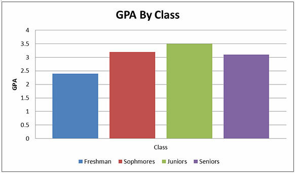
Bar graphs are used when you want to provide a visual representation of the relationship between one continuous variable and one discontinuous variable. Usually the discontinuous variable is the dependent variable (although not always), and it is placed on the x-axis. The continuous variable is plotted on the y-axis, and bars are used to plot the data. For example, if I want to show the relationship between GPA (a continuous variable) and the age of students by school year (a discontinuous variable), I can make a bar graph:
Figure 5.
Parts of a bar graph
A bar graph will have the same parts as a line graph or scatter plot, including a title, axes, axis labels, a legend, and an origin.
Scale and readability
As with other types of graphs, it's important to pay attention to the scale on a bar graph. Leaving out the zero or stretching the y-axis too far can distort data, making your findings seem either bigger or less significant than they actually are.
Readability is also an important issue for bar graphs, which, in addition to the issues listed above for line graphs, come with their own challenges. Chief among these problems is sizing and shading the bars. Placing the bars too close together or two far apart can make graphs difficult to read, as can using crazy shadings or colors to fill in the bars. Take a look at how hard this graph is to understand:
Figure 6.
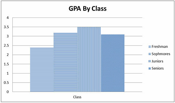
Setting the bars apart and using shading instead of wacky patterns will help make your bar graph easy to read. It's also a good idea to avoid using effects like shadowing or 3-D bars, which won't add anything to the substance of your argument but can easily confuse readers.
Horizontal bar graphs
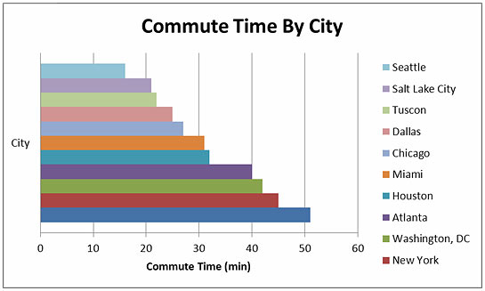
When you have a large number of bars, it can be easier to put the discontinuous variable on the y-axis. For example, in this graph that shows commute time by city, the names of the cities are places horizontally in order to show the trend upwards:
Figure 7.
Pie Charts
Pie charts are used to show percentages of a whole by dividing up a circle into slices that represent the relative sizes of each data group. Here's an example of a pie chart that shows where high school students go after graduation:
Figure 8.
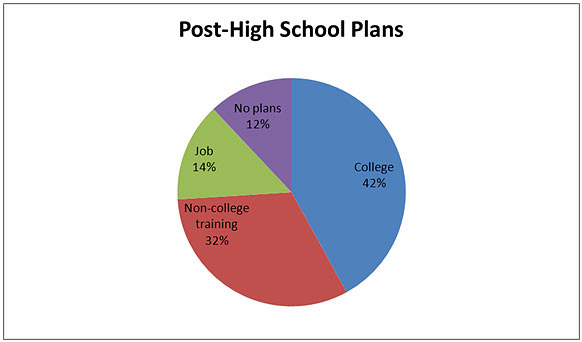
Pie charts are common in many forms of media, including website and newspaper articles, but are rarely needed in scientific articles. For example, the data in Fig. 8 could easily be included in a table or even in the text (e.g., "After graduation, 42% of student planned to attend college, 32% planned to start non-college training, 14% had job offers, and 12% had no plans.").
Figures are one of the most important tools in an academic writer's toolbox. They allow you to quickly and succinctly communicate data and ideas to the reader in a way that's memorable and easy to understand, but they only work when you take the time to ensure that they're done right.


